Visualizing Garmin GPS Data
The goal of this project was to explore my running, cycling and swimming data from the past 5 years. Applications like Strava and Garmin Connect provide good tools for visualizing training data over short periods of time but aren't good for looking at how your training has changed over the course of years. This project is an attempt to fill that gap.
I started running in 2009 when I joined my high school’s cross-country team but it wasn’t until June of 2014 that I got my first GPS watch and began recording my runs. I wanted to get an in-depth picture of my running habits and my dive into triathlons. The data for this article was downloaded from my Garmin Connect account. The charts in this article were created with R and ggplot2, if you are interested in the code used to generate the visualization in this article please visit my github page .
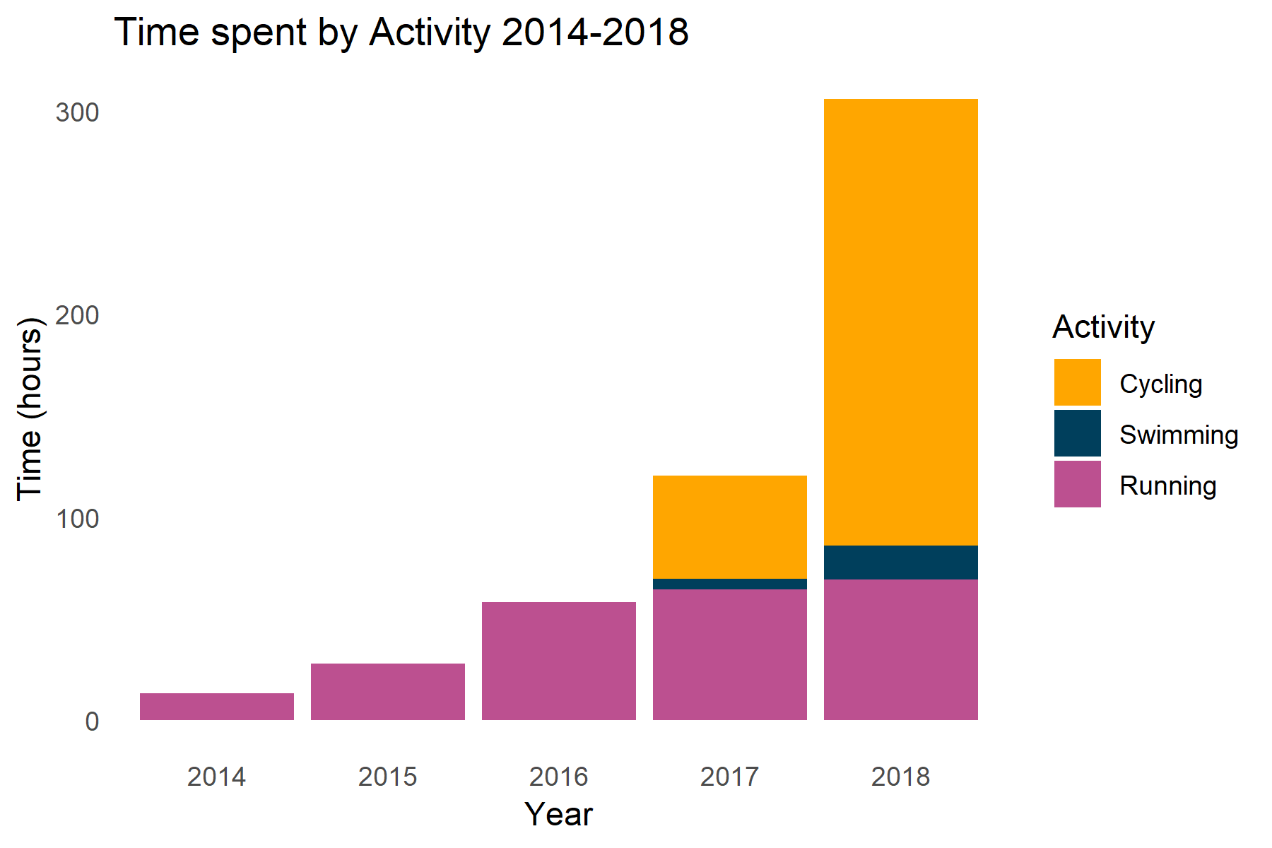
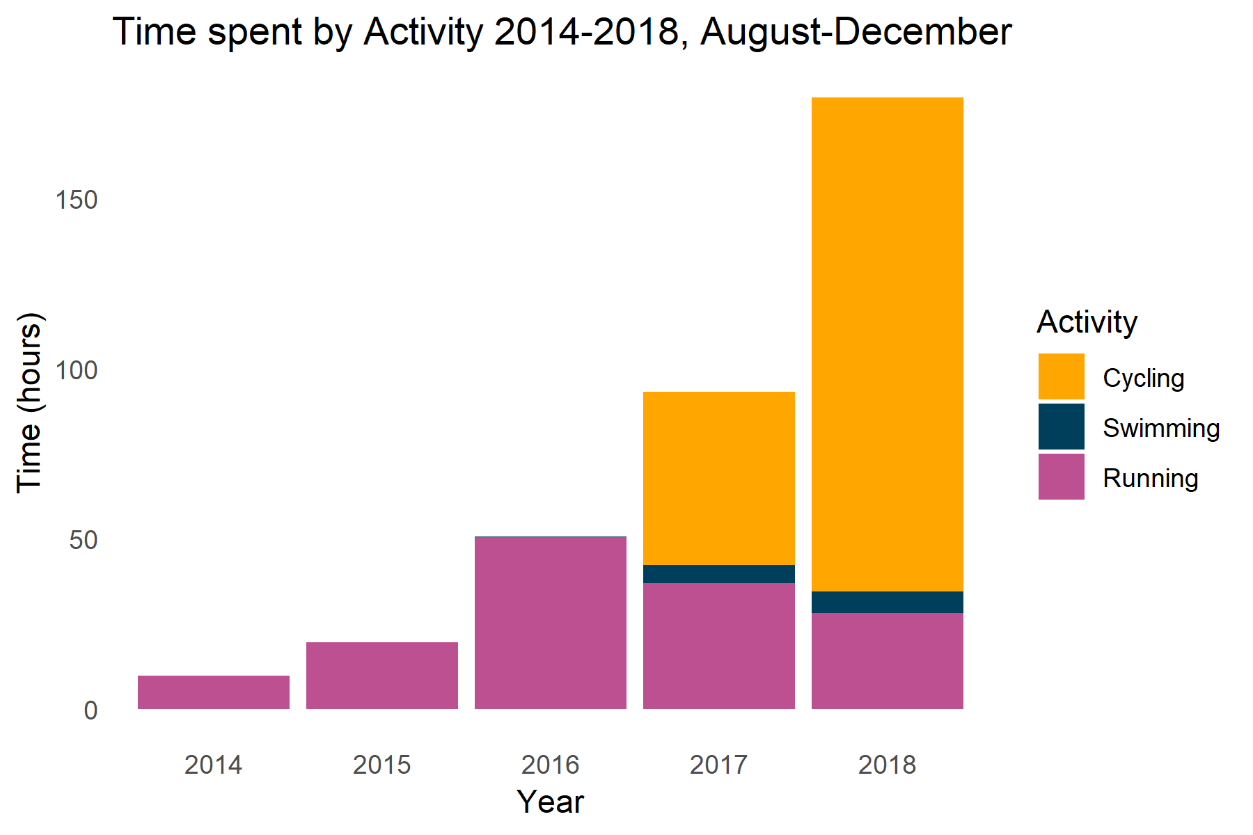
My running volume has stayed relatively the same for the past two years but my cycling and swimming have increased. This is partially because I only started recording swimming and biking in August for 2017 when I got a multi-sport watch. When controlling for the time between August and December my running decreased slightly, swimming stayed the same and cycling increased.
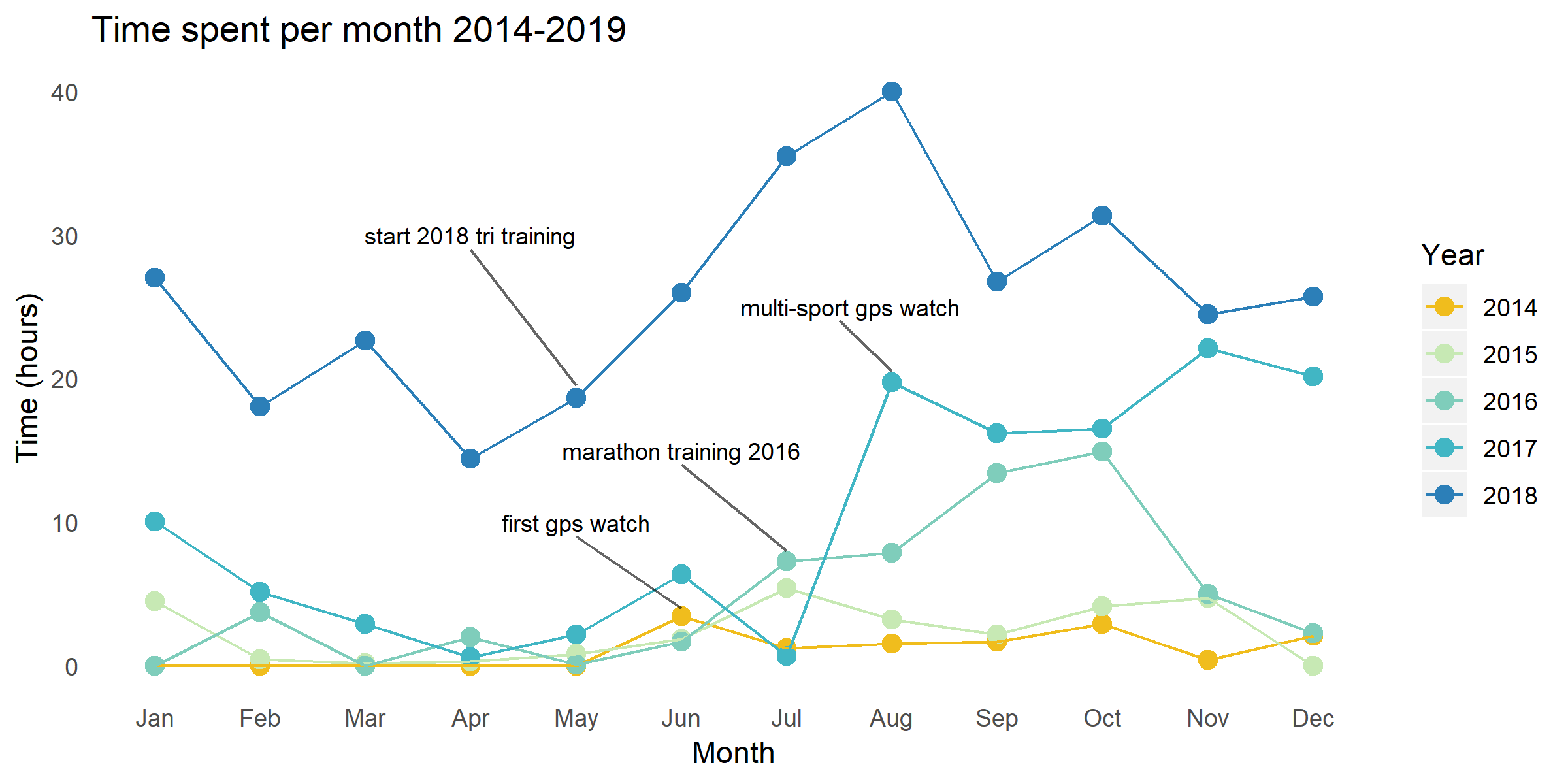
I started road cycling in June of 2017 but didn’t start recording my rides until August 2017 when I got a multi-sport GPS watch. From that point on, the amount of time I spent exercising stayed elevated above the previous years.
Cycling
I was interested to see how my cycling habits varied throughout the year. Intuitively, I felt like I rode slower and for shorter distances in the winter.
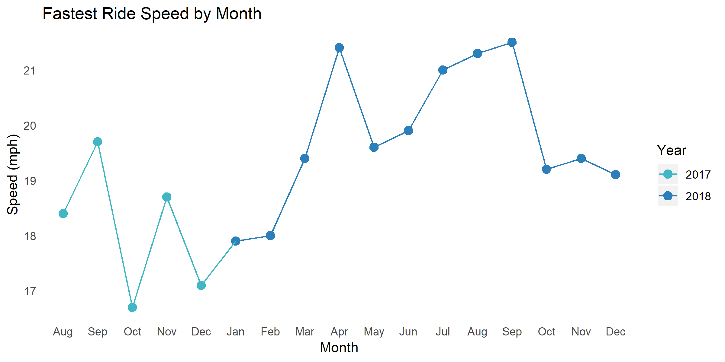
The chart above was generated by finding the fastest ride speed for each month. There seems to be two trends going on: my fastest rides have generally gotten faster and I tend to ride faster in the warmer months. My average speed in the cooler months (November – March) was 16.6 mph and 17.8 mph in the warmer months (April – October).
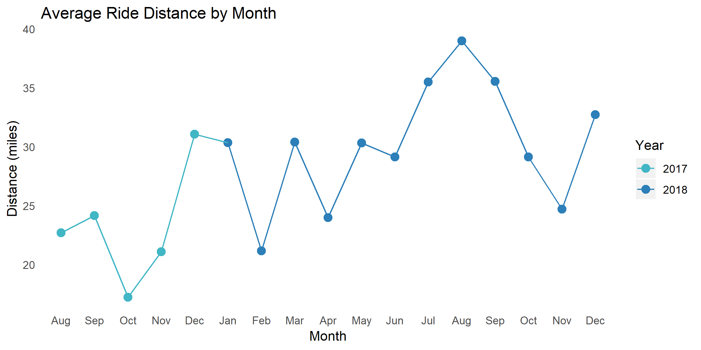
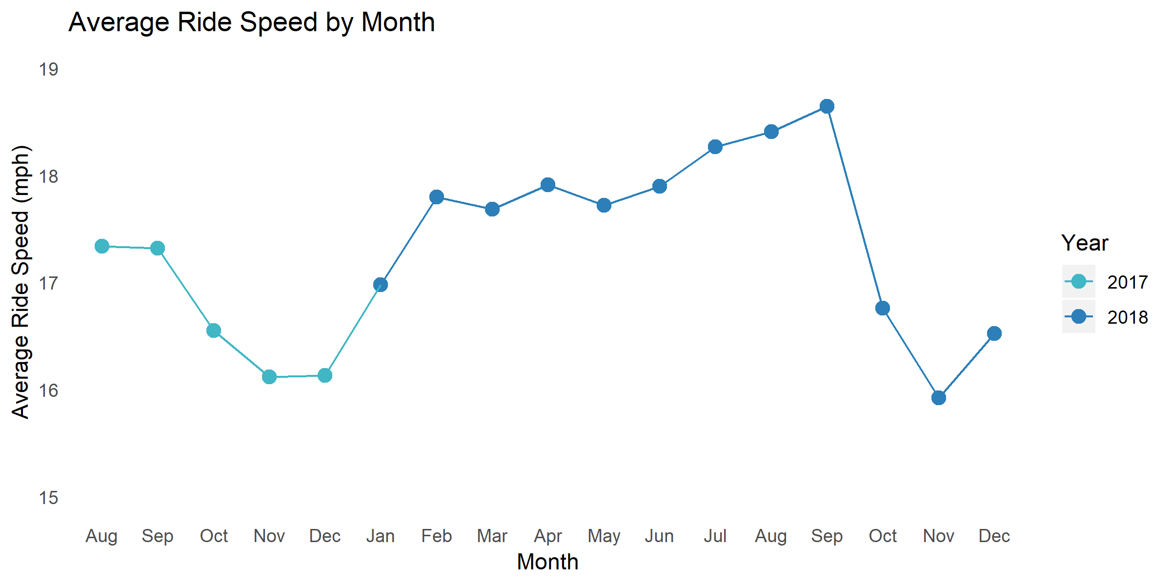
My average ride distance peaked in August 2018 but varied by month. The average speed of all my rides steadily increased between May 2018 to September 2018. This increase in ride speed was likely due to the focused training I started in May to prepare for the triathlon I did in September.
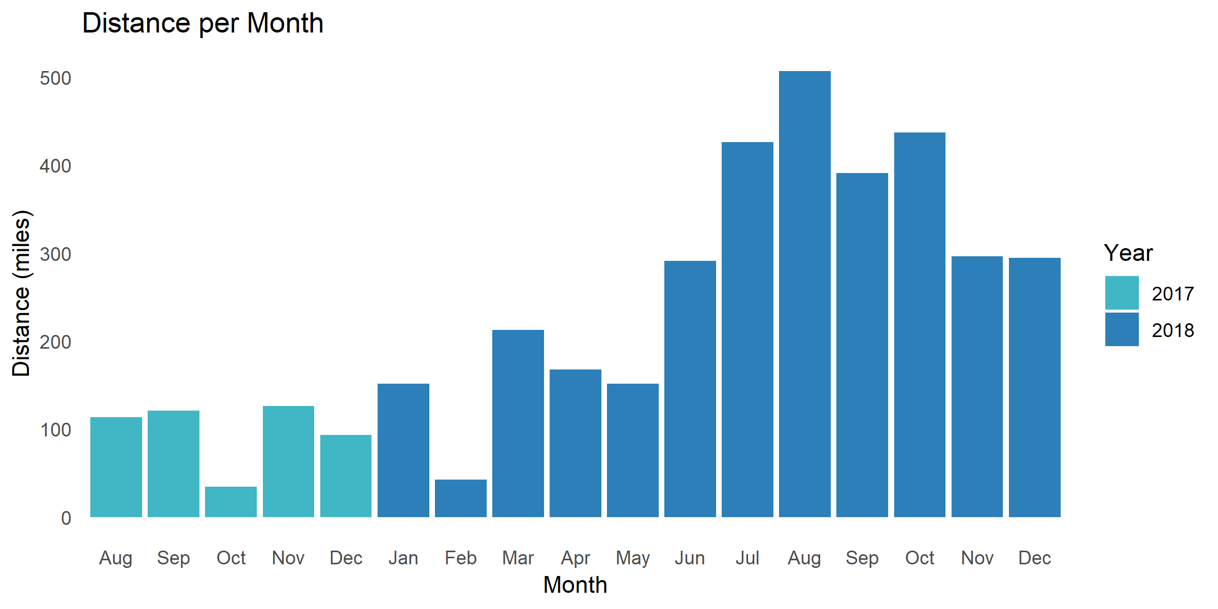
As expected, I rode more in the warmer months than I did during the winter months.
Running
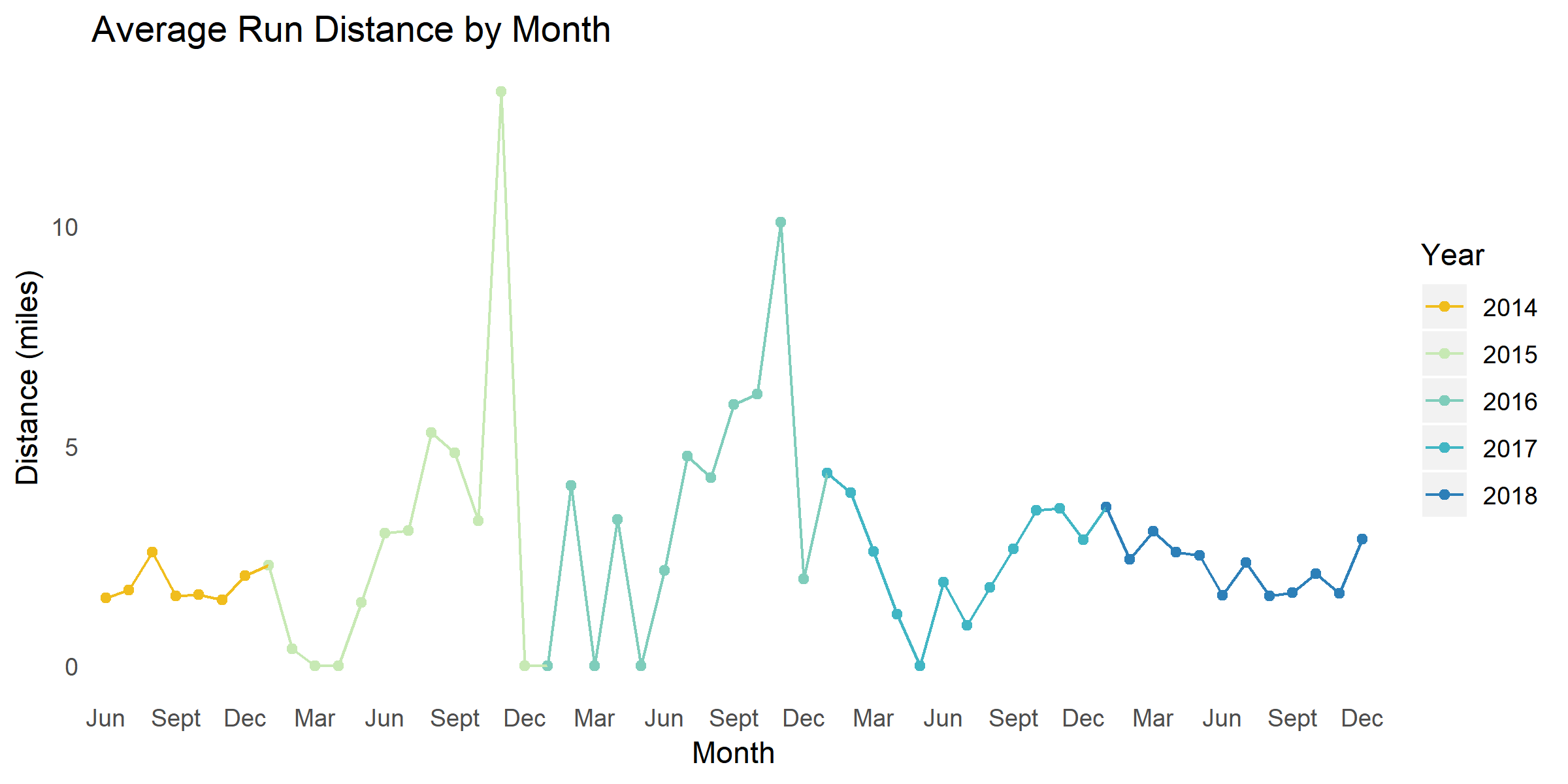
The two spikes in November 2015 and 2016 are from the marathons I ran those years. The average was heavily skewed since I took time off after those races.
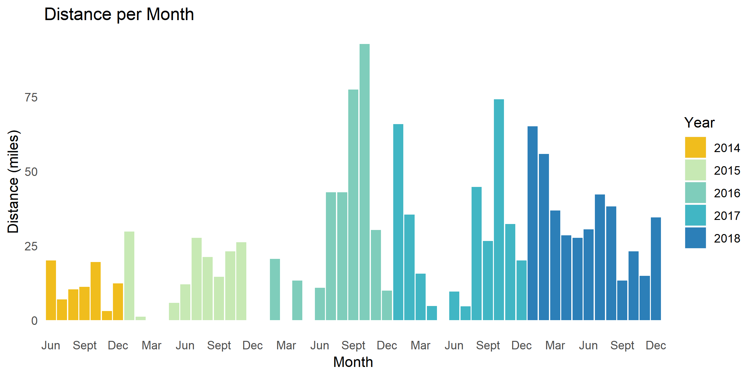
I expected my running distance to have decreased since I took up biking and swimming but the opposite seems to be true. I have become more consistent with running since June 2017 when I started cycling.
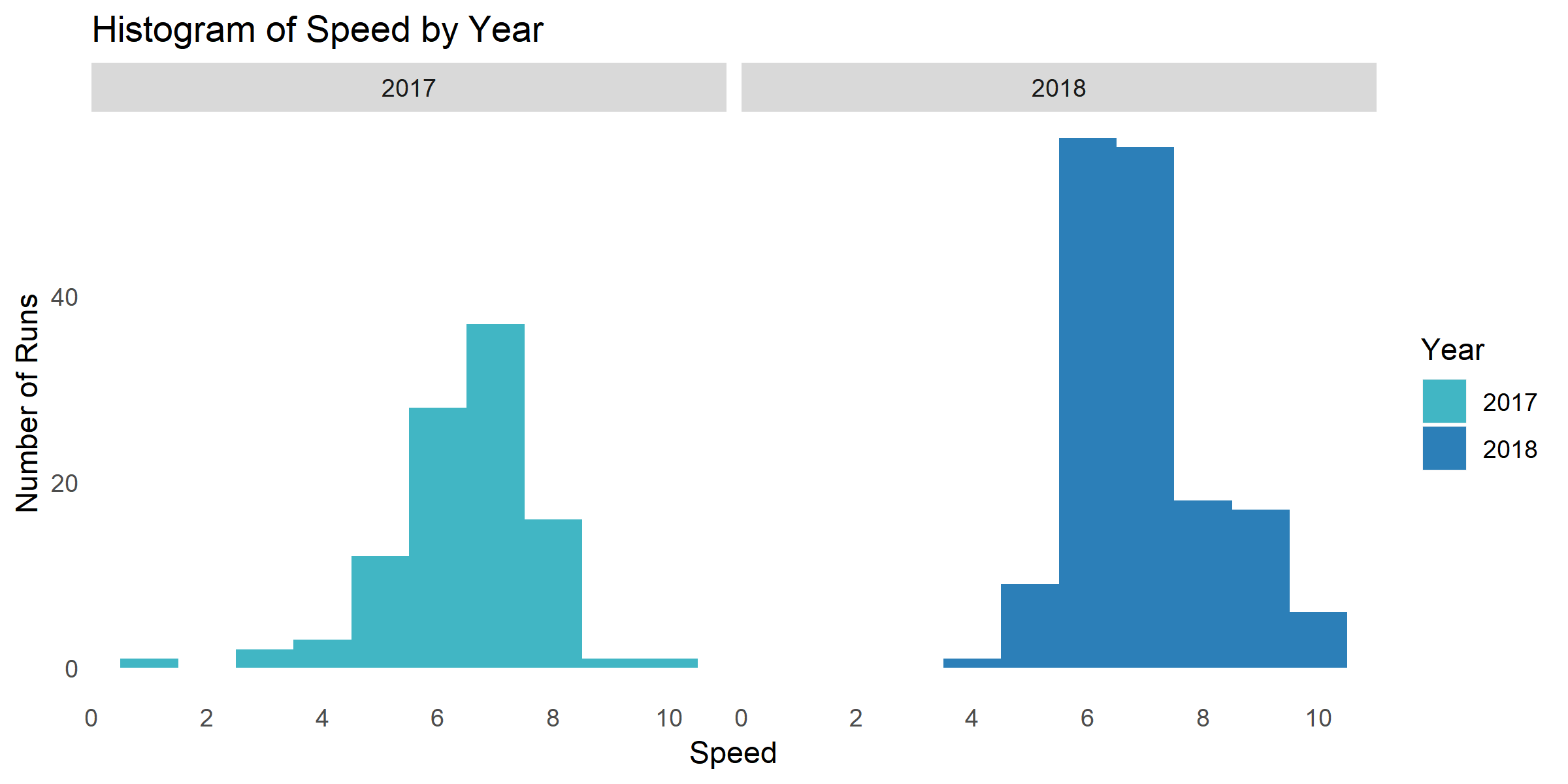
I was interested to know how the distribution of my running speed has changed over the past two years. The majority of my runs for both 2017 and 2018 were between 6 and 7 mph, but in 2018 I started doing more runs in the 8 – 10 mph range and fewer runs less than 6 mph.
Swimming
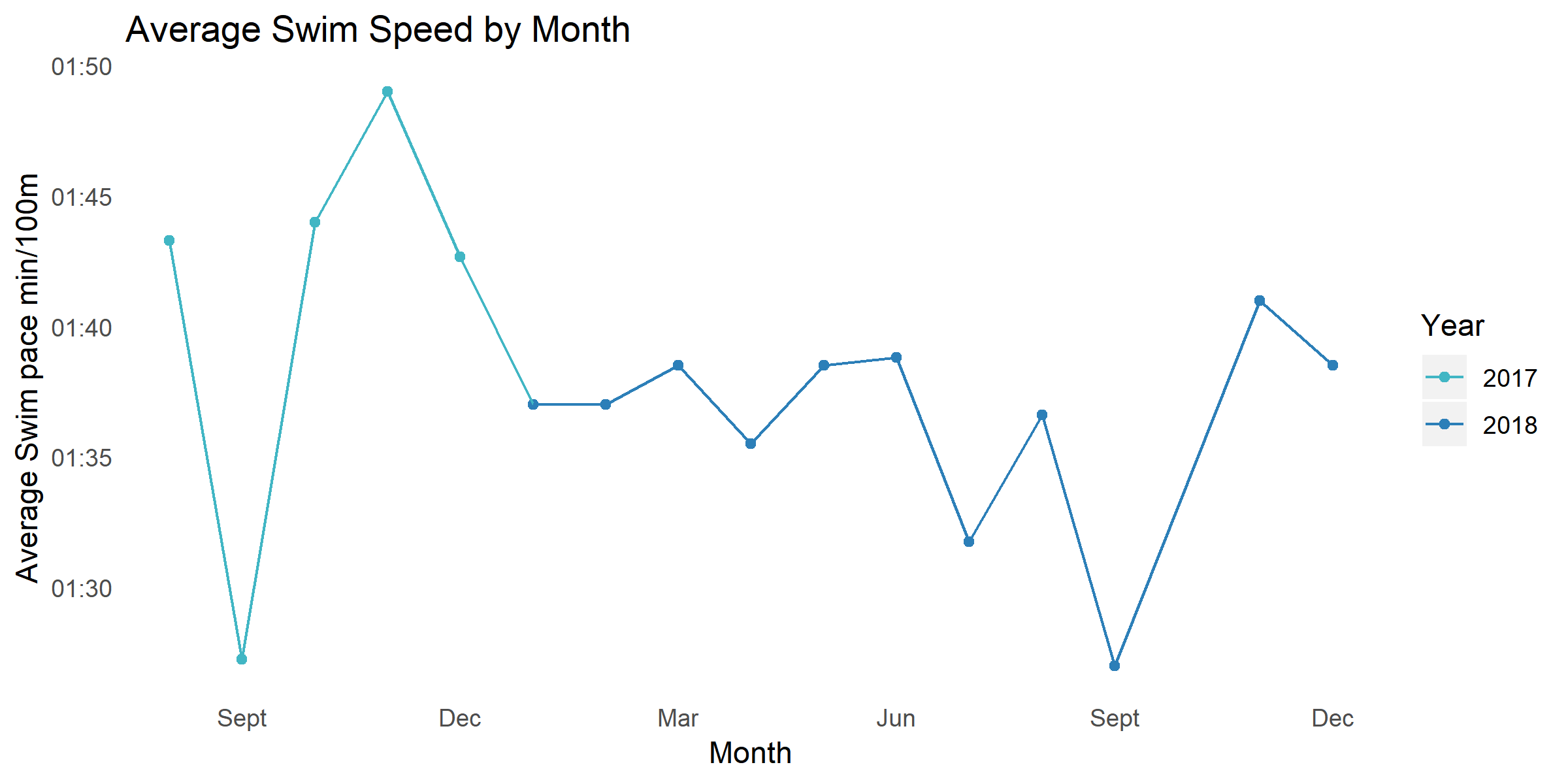
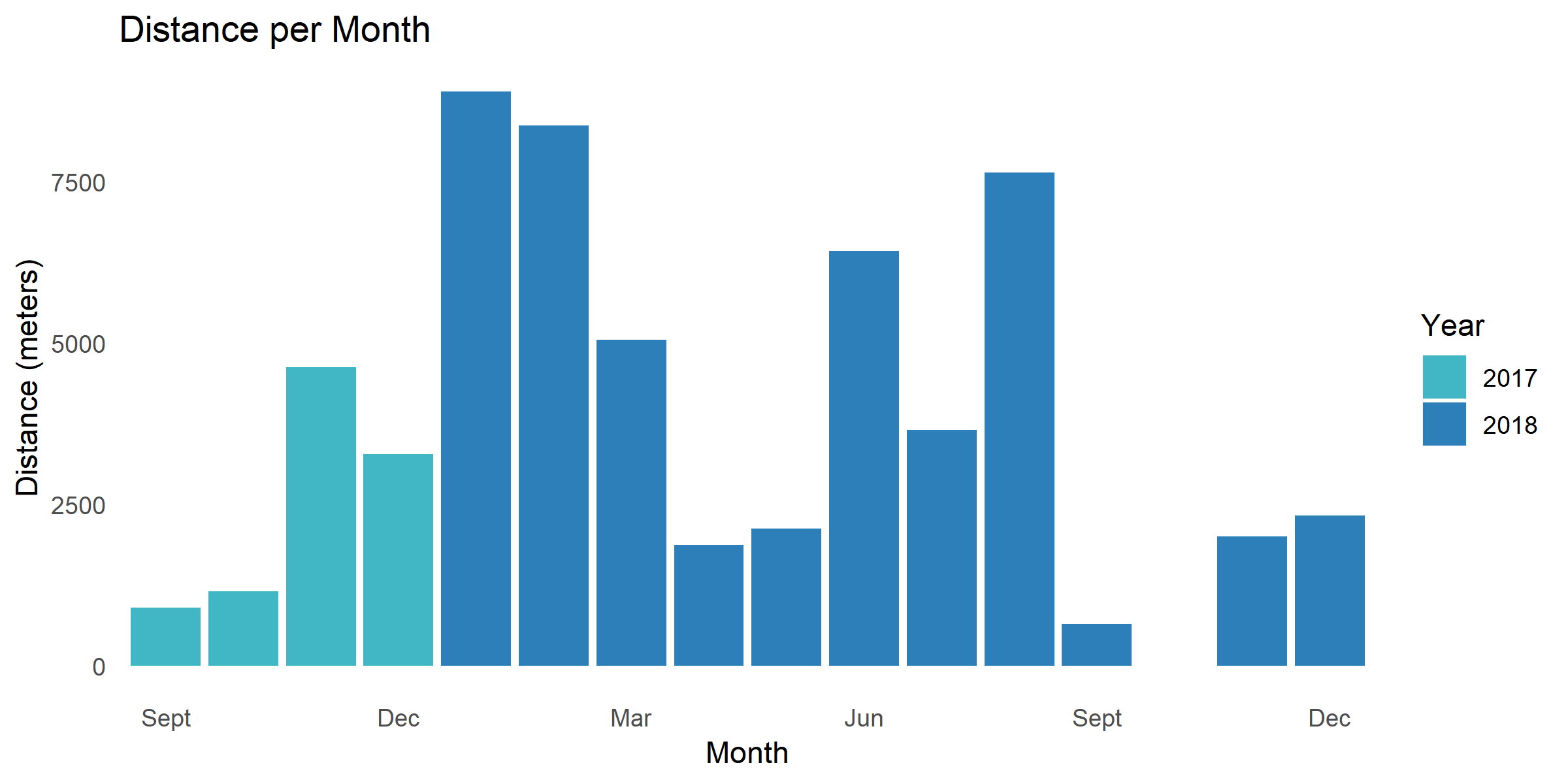
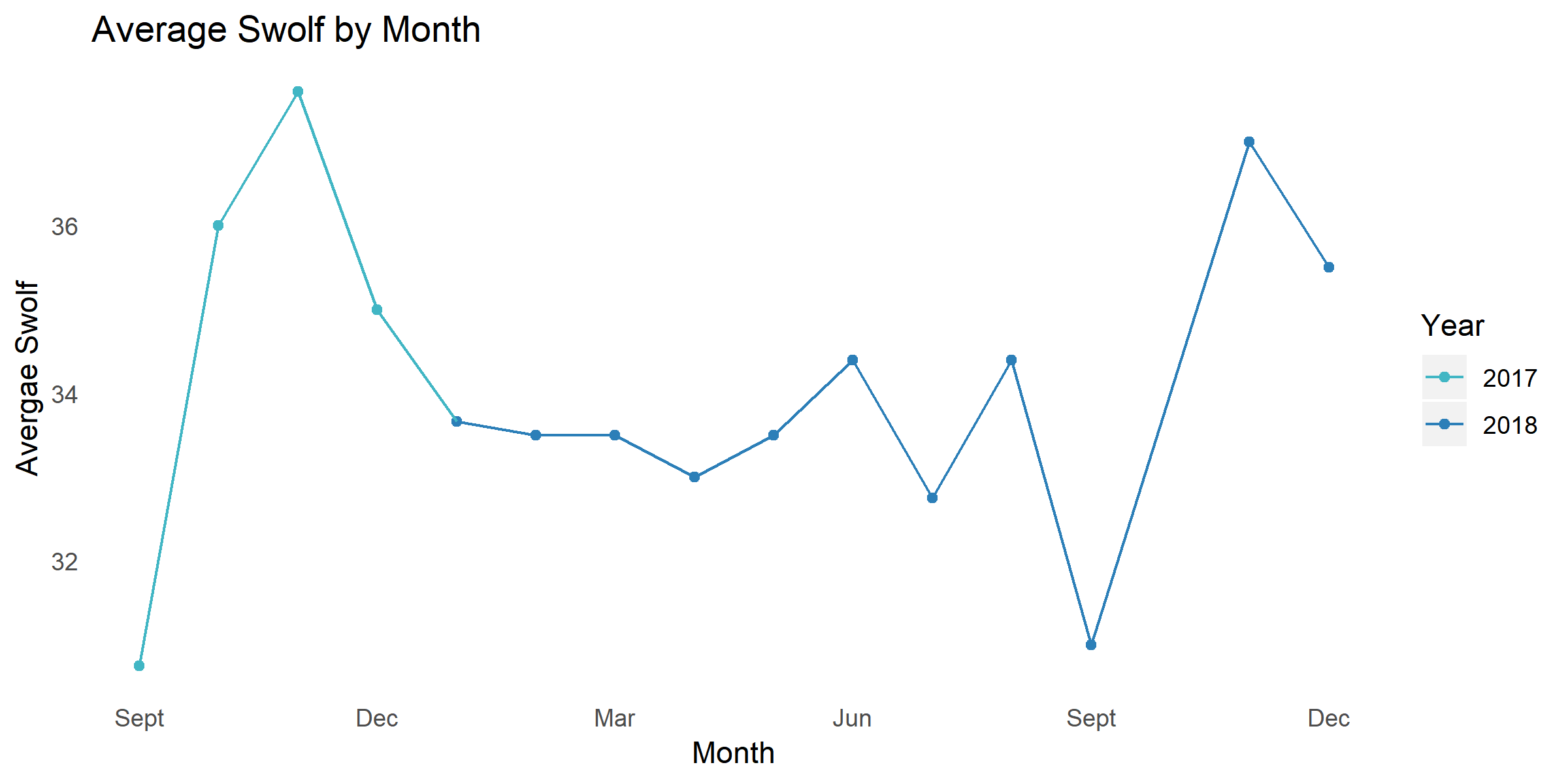
Swolf is a metric of swimming efficient with a lower number indicating higher efficiency. My swim efficient improved leading up to the triathlon I did in September 2018 and worsened after my last triathlon of the season.
It is interesting to see how much more time I spent exercising per year after I took up cycling. I thought the amount of time I spent running would have decreased after I started cycling since the number of days a week I spend running decreased to 3 days or less but I became more consistent which lead to an increase over the course of a year.